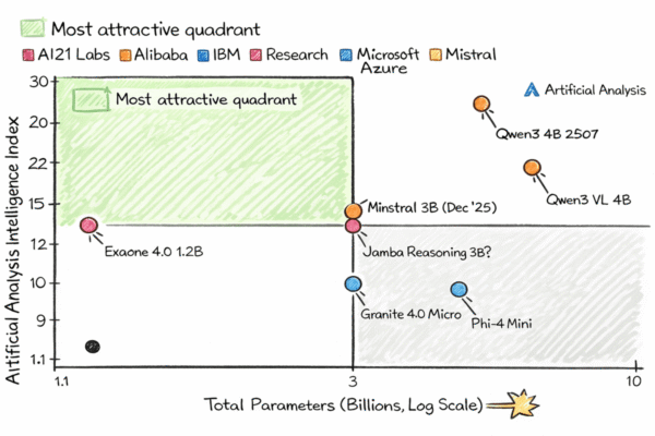
I still remember the exact moment. I had been grinding away at a machine learning project for days — obsessing over hyperparameters, tweaking my random forest, and trying to squeeze out just one more percentage point of accuracy. But when I finally stopped, almost out of frustration, and decided to simply plot the data, something clicked. A single graph revealed insights that no model, however complex, had given me up to that point.
That day changed the way I think about data. It was the day I realized that visualization wasn’t just a supporting act to machine learning — it was sometimes more powerful, more intuitive, and, honestly, more human.
The Problem I Was Trying to Solve
I was working on a dataset of customer churn. The classic problem: predict who’s going to leave a service and who’s going to stay. Naturally, my first instinct was to jump into modeling. Scikit-learn, train-test split, random forests — the whole nine yards.
But after hours of iterating, the improvements were marginal. Something felt off.


