Trying to Make the Perfect Pie Chart in CSS | CSS-Tricks
By
Estimated read time
12 min read
February 9, 2026
Speaking of charts… When was the last time you had to use a pie chart? If you are one of those people who have to give presentations right and left, then congratulations! You are both in my personal hell… and also surrounded by pie charts. Luckily, I think I haven’t needed to use them in ages, or at least that was until recently.
Last year, I volunteered to make ta webpage for a kids’ charity in México1. Everything was pretty standard, but the staff wanted some data displayed as pie charts on their landing page. They didn’t give us a lot of time, so I admit I took the easy route and used one of the many JavaScript libraries out there for making charts.
It looked good, but deep down I felt dirty; pulling in a whole library for a couple of simple pie charts. Feels like the easy way out rather than crafting a real solution.
I want to amend that. In this article, we’ll try making the perfect pie chart in CSS. That means avoiding as much JavaScript as possible while addressing major headaches that comes with handwriting pie charts. But first, let’s set some goals that our “perfect” should comply with.
In order of priority:
This must be semantic! Meaning a screen reader should be able to understand the data shown in the pie chart.
This should be HTML-customizable! Once the CSS is done, we only have to change the markup to customize the pie chart.
This should keep JavaScript to a minimum! No problem with JavaScript in general, it’s just more fun this way.
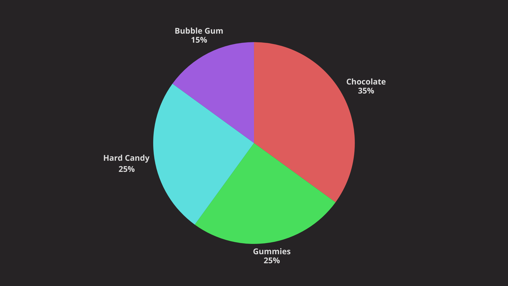
Once we are done, we should get a pie chart like this one:
Is this too much to ask? Maybe, but we’ll try it anyways.
Conic gradients suck aren’t the best
We can’t talk about pie charts without talking first about conic gradients. If you’ve read anything related to theconic-gradient()function, then you’ve likely seen that they can be used to create simple pie charts in CSS. Heck, even I have said so inthe almanac entry. Why not? If only with one element and a single line of CSS…
However, this method blatantly breaks our first goal of semantic pie charts. As it’s later noted on the same entry:
Do not use theconic-gradient()function to create a real pie chart, or any other infographics for that matter. They don’t hold any semantic meaning and should only be used decoratively.
Remember that gradients are images, so displaying a gradient as abackground-imagedoesn’t tell screen readers anything about the pie charts themselves; they only see an empty element.
This also breaks our second rule of making pie charts HTML-customizable, since for each pie chart we’d have to change its corresponding CSS.
So should we ditchconic-gradient()altogether? As much as I’d like to, its syntax is too good to pass so let’s at least try to up its shortcomings and see where that takes us.
Improving semantics
The first and most dramatic problem withconic-gradient()is its semantics. We want a rich markup with all the data laid out so it can be understood by screen readers. I must admit I don’t know the best way to semantically write that, but after testing withNVDA, I believe this is a good enough markup for the task:
  Candies sold last month

    Chocolates
    Gummies
    Hard Candy
    Bubble Gum
Ideally, this is all we need for our pie chart, and once styles are done, just editing thedata-*attributes or adding new
elements should update our pie chart.
Just one thing though: In its current state, thedata-percentageattribute won’t be read out loud by screen readers, so we’ll have to append it to the end of each item as a pseudo-element. Just remember to add the “%” at the end so it also gets read:
So, is it accessible? It is, at least when testing in NVDA. Here it is in Windows:
You may have some questions regarding why I chose this or that. If you trust me, let’s keep going, but if not, here is my thought process:
Why usedata-attributes instead of writing each percentage directly?
We could easily write them inside each
, but using attributes we can get each percentage on CSS through theattr()function. And as we’ll see later it makes working with CSS a whole lot easier.
Why?
The
element can be used as a self-contained wrapper for our pie chart, and besides images, it’s used a lot for diagrams too. It comes in handy since we can give it a title insideand then write out the data on an unordered list, which I didn’t know was among the content permitted insidesinceis considered flow content.
Why not use ARIA attributes?
We could have used anaria-descriptionattribute so screen readers can read the corresponding percentage for each item, which is arguably the most important part. However, we may need to visually show the legend, too. That means there is no advantage to having percentages both semantically and visually since they might get read twice: (1) once on thearia-descriptionand (2) again on the pseudo-element.
Making it a pie chart
We have our data on paper. Now it’s time to make it look like an actual pie chart. My first thought was, “This should be easy, with the markup done, we can now use aconic-gradient()!”
Well… I was very wrong, but not because of semantics, but how the CSS Cascade works.
Let’s peek again at theconic-gradient() syntax. If we have the following data:
Item 1: 15%
Item 2: 35%
Item 3: 50%
…then we would write down the followingconic-gradient():
.gradient {
  background:
    conic-gradient(
      blue 0% 15%,
      lightblue 15% 50%,
      navy 50% 100%
    );
}
This basically says: “Paint the first color from 0 to 15%, the next color from 15% to 50% (so the difference is 35%), and so on.”
Do you see the issue? The pie chart is drawn in a singleconic-gradient(), which equals a single element. You may not see it, but that’s terrible! If we want to show each item’s weight insidedata-percentage — making everything prettier — then we would need a way to access all these percentages from the parent element. That’s impossible!
The only way we can get away with the simplicity ofdata-percentageis if each item draws its own slice. This doesn’t mean, however, that we can’t useconic-gradient(), but rather we’ll have to use more than one.
The plan is for each of these items to have their ownconic-gradient()painting their slice and then place them all on top of each other:
To do this, we’ll first give each
some dimensions. Instead of hardcoding a size, we’ll define a--radiusproperty that’ll come in handy later for keeping our styles maintainable when updating the HTML.
Then, we’ll get thedata-percentageattribute into CSS usingattr()and itsnew type syntax that allows us to parse attributes as something other than a string. Just beware that the new syntax is currently limited to Chromium as I’m writing this.
However, in CSS it is far better to work with decimals (like0.1) instead of percentages (like10%) because we can multiply them by other units. So we’ll parse thedata-percentageattribute as aand then divide it by100to get our percentage in decimal form.
Lastly, we’ll get thedata-colorattribute from the HTML usingattr()again, but with thetype this time instead of a :
.pie-chart li {
  /* ... */
  --bg-color: attr(data-color type());
}
Let’s put the --weighing variable aside for nowand use our other two variables to create theconic-gradient()slices. These should go from 0% to the desired percentage, and then become transparent afterwards:
I am defining the starting 0% and ending 100% explicitly, but since those are the default values, we could technically remove them.
Here’s where we’re at:
Perhaps an image will help if your browser lacks support for the new attr() syntax:
Now that all the slices are done, you’ll notice each of them starts from the top and goes in a clockwise direction. We need to position these, you know, in a pie shape, so our next step is to rotate them appropriately to form a circle.
This is when we hit a problem: the amount each slice rotates depends on the number of items that precede it. We’ll have to rotate an item by whatever size the slice before it is. It would be ideal to have an accumulator variable (like --accum) that holds the sum of the percentages before each item. However, due to the way the CSS Cascade works, we can neither share state between siblings nor update the variable on each sibling.
And believe me, I tried really hard to work around these issues. But it seems we are forced into two options:
Hardcode the--accumvariable on eachelement.
Use JavaScript to calculate the--accumvariable.
The choice isn’t that hard if we revisit our goals: hardcoding--accumwould negate flexible HTML since moving an item or changing percentages would force us to manually calculate the--accumvariable again.
With--accumout of the way, we can rotate eachconic-gradient()using thefromsyntax, that tells the conic gradient the rotation’s starting point. The thing is that it only takes an angle, not a percentage. (I feel like a percentage should also work fine, but that’s a topic for another time).
To work around this, we’ll have to create yet another variable — let’s call it--offset— that is equal to --accumconverted to an angle. That way, we can plug the value into eachconic-gradient():
This little bit of CSS arranges all of the slices in the dead center of the .pie-chart container, where each slice covers the container’s only row and column. They slices won’t collide because they’re properly rotated!
Except for those overlapping labels, we’re in really, really good shape! Let’s clean that stuff up.
Positioning labels
Right now, the name and percentage labels inside the are splattered on top of one another. We want them floating next to their respective slices. To fix this, let’s start by moving all those items to the center of the .pie-chart container using the same grid-centering trick we we applied on the container itself:
Luckily, I’ve already explored how to lay things out in a circleusing the newer CSS cos() and sin(). Give those links a read because there’s a lot of context in there. In short, given an angle and a radius, we can usecos()andsin()to get the X and Y coordinates for each item around a circle.
For that, we’ll need — you guessed it! — another CSS variable representing the angle (we’ll call it --theta) where we’ll place each label. We can calculate that angle this next formula:
Oh wait, just one more minor detail. The label and percentage for each item are still stacked on top of each other. Luckily, fixing it is as easy as translating the percentage a little more on the Y-axis:
I’d call this a really good start toward a “perfect” pie chart, but there are still several things we could improve:
The pie chart assumes you’ll write the percentages yourself, but there should be a way to input the raw number of items and then calculate their percentages.
The data-color attribute is fine, but if it isn’t provided, we should still provide a way to let CSS generate the colors. Perhaps a good job for color-mix()?
What about different types of charts? Bar charts, anyone?
This is sorta screaming for a nice hover effect, like maybe scaling a slice and revealing it?
That’s all I could come up with for now, but I’m already planning to chip away at those at follow up with another piece (get it?!). Also, nothing is perfect without lots of feedback, so let me know what you would change or add to this pie chart so it can be truly perfect!
1 They are great people helping kids through extremely difficult times, so if you are interested in donating, you can find more ontheir socials. ↪️